
Architecture’s Relationship to Graphic Design: The Grid
Graphic design has a strong relationship with architecture; the two have coexisted in built environments for a long time. In the field of architecture, great graphic design will echo the building’s message and support the architecture. While the two disciplines have their own language, they can communicate beautifully: architecture speaks form and space; graphic design speaks visual stories of these spaces through typography, images, and symbols. The heart of both disciplines is what they have in common: the grid system, a foundation where both disciplines can relate and inspire one another.
As WHA’s marketing graphic designer, I design promotional pieces for the firm. I enjoy looking at different architectural styles for inspiration before I make graphic design decisions. Some of the styles that I often return to are Brutalism, Mid-Century Modern, and Bauhaus. The latter style, formally known as The Staatliches Bauhaus (a German art school founded by German architect Walter Gropius that operated from 1919-1933), not only held a strong influence in architecture, but also furniture, art, sculpture, graphic design and so much more. Bauhaus became more than a school– it became a radical movement that set the stage for the International Style and Modernism’s evolution. From all its great impact, Bauhaus continually inspires me because of the influence it carries on modern graphic design’s typography and strong use of the grid.
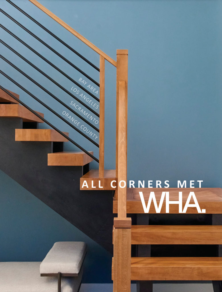
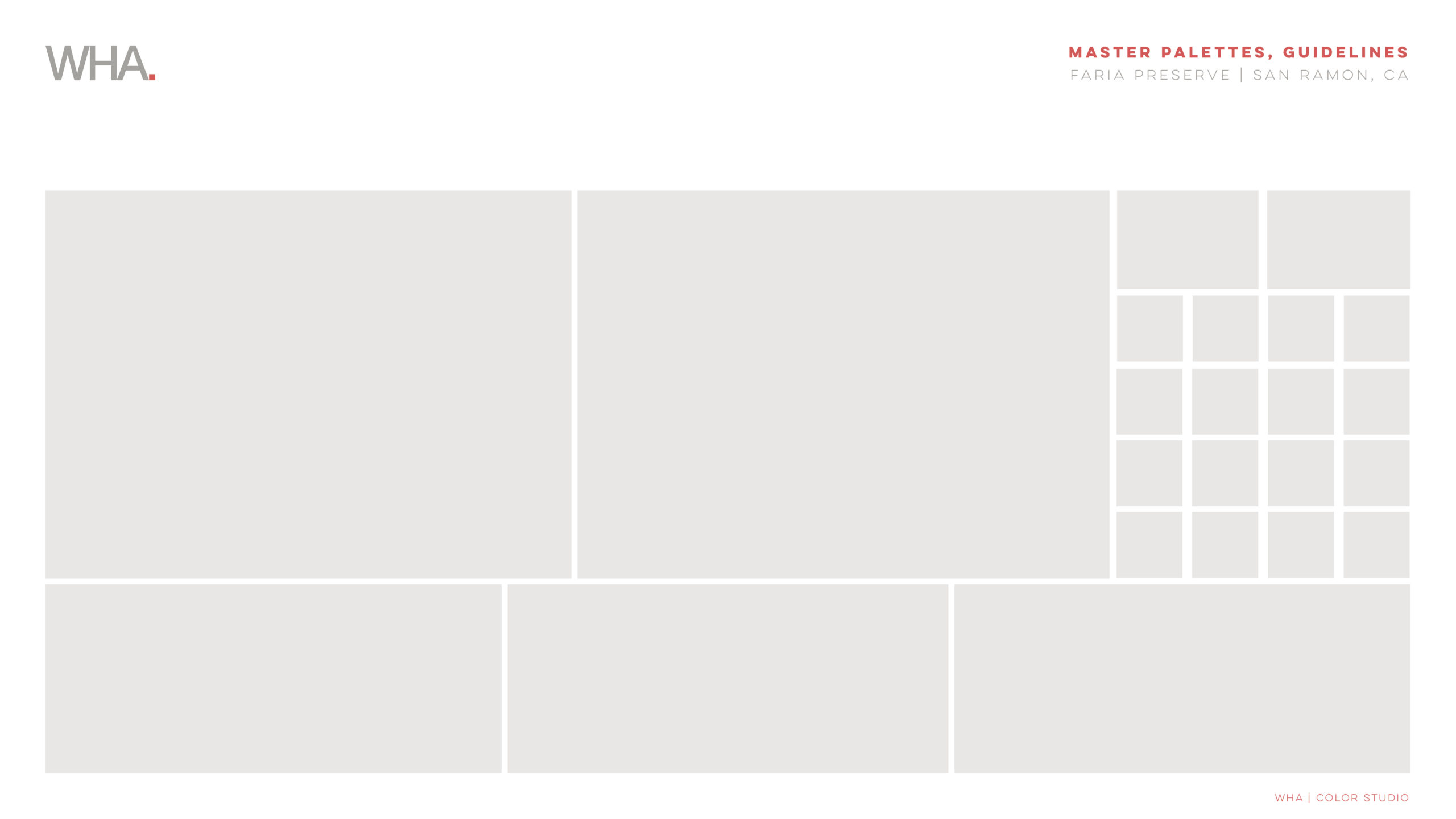
One design option for a WHA advertisement at the 2022 SoCal MAME Awards last October was influenced by Bauhaus teaching. The quarter page ad features our firm’s project, Kings Canyon. Using the photograph of the interior’s entry, I played with the staircase to dictate what my grid would be. This experimental grid was taken from architecture for the use of graphic design, as you can see the words of WHA’s office locations, slogan, and logo following the architect’s grid for the staircase. Here, the Bauhaus principle “form follows function” is integrated into this advertising piece through grid logic, which was heavily used during this era, especially in paintings that were inspired by architectural renderings. László Moholy-Nagy, a painter, photographer, and Bauhaus school professor, produced many of these grid forms that have impacted type grids for graphic designers such as myself.
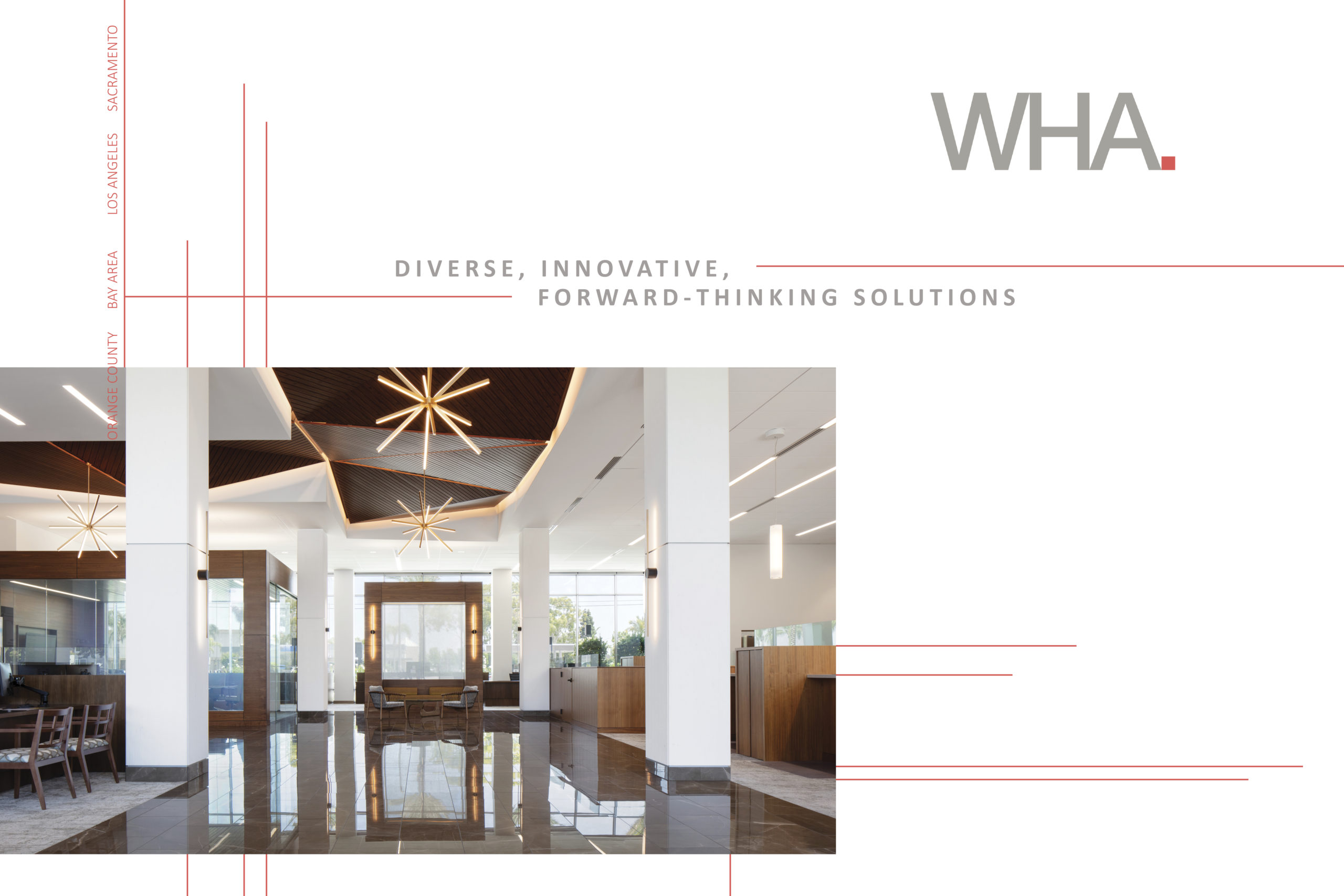
Another WHA marketing advertisement that integrates grid principles from Bauhaus was from the BIA Bay Area Women’s Conference last September. This sponsorship ad highlights WHA’s workplace project, Farmers & Merchants Bank. Using the lobby’s architecture, I followed the imaginary lines from the construction of the building and placed them behind the photograph, drawing them out beyond the image. These floating thin line-weight planes created the type grid for this ad, reflecting the congruent relationship between architecture and graphic design. Another influential figure was graphic designer Herbert Bayer, who worked in an architecture and design workshop before becoming a Bauhaus student and eventuality led typography workshops; he is best known for his typography and creating the typeface called Universal in 1925. This new typeface rejected serifs, which reflected the clean architectural look from the International Style. Similarly, our WHA typefaces that we use are sans-serif, representing a minimal, clean, and modern brand.
Though other styles of architecture can be identified in graphic design, it is the grid principle from the Bauhaus that creates this foundational relationship between these two disciplines that I am passionate about visually incorporating into WHA marketing. Just within WHA’s environment alone, you can find the heart of Bauhaus through our integrated culture of diverse collaboration among each studio. I think the unity of architecture and design here at WHA would make Gropius proud.


Leave a Reply