
Architecture’s Relationship to Graphic Design: Brutalism
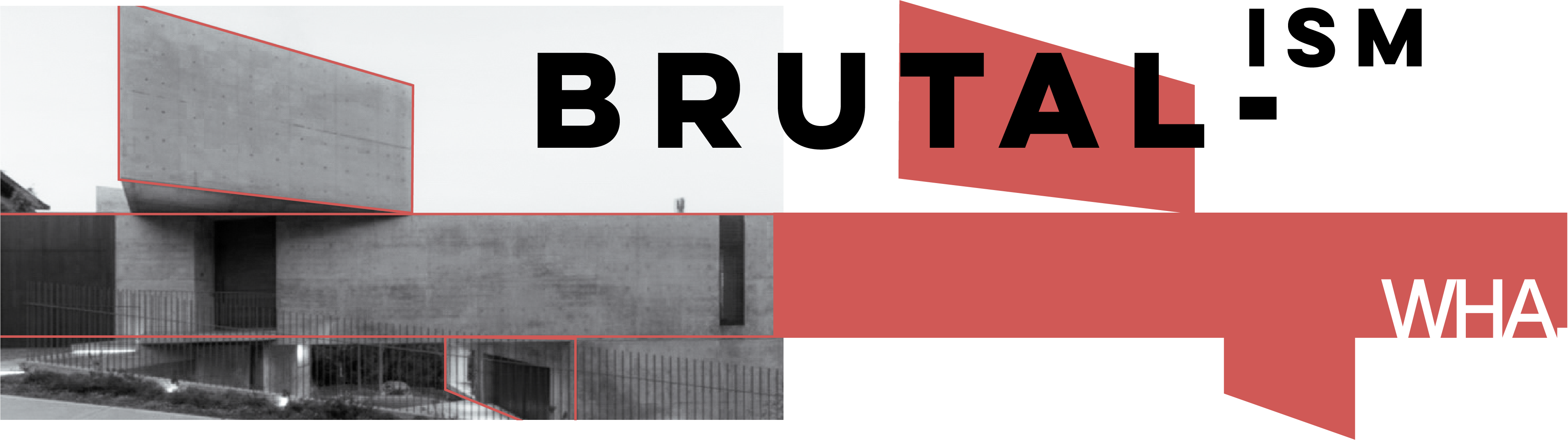 Brutalism, as an architectural style, has been seen as controversial in recent years; for graphic designers, it is an inspiring and relatable one because of its strong sense of grid, shape, and boldness. Brutalism emerged from the modernist avant-garde movement known as Constructivism. It materialized to solve urgent reconstruction needs post World War II through architectural functionalism and simplicity, which is why large-scale, cold, rough concrete buildings are what come to mind first. Brutalist graphic design similarly depicts heavy-weight modern typography, bold imagery, and geometric shapes.
Urban landscape has changed ever since Brutalism revolutionized labor methods and material use of concrete as well as its affordability thanks to Le Corbusier, the Swiss French architect, urban planner, and 1920s Constructivist who paved the way for Brutalism to develop. Concrete was functional because of its ability to be poured into molds of any shape. The removal of color and other decorative material simplified this raw architectural style and exposed how much Brutalism values usefulness and exemplified the design concept “form follows function.” In the 1940s, this concept not only lived in Brutalist architecture, but also in Brutalist graphic design through the Art Brut (“Raw Art”) movement, which prioritized authenticity and rebelling from traditionalism. As any art gets critiqued, these architects and artists’ rebellious styles were viewed as “brutal,” hence the name Brutalism.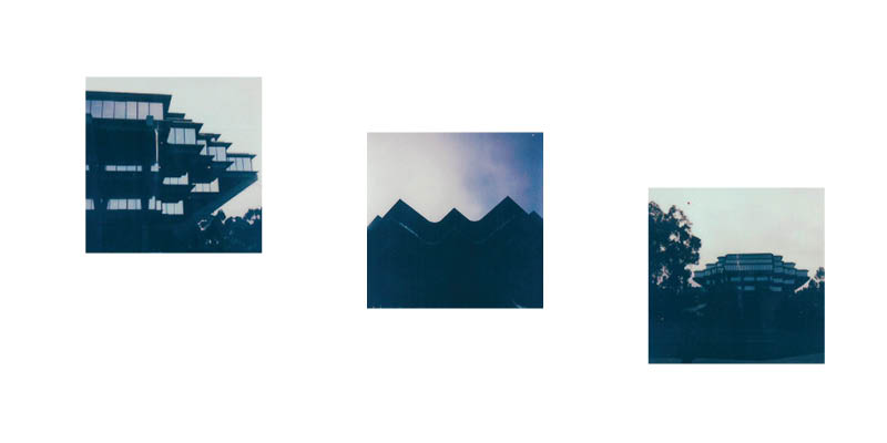 Brutalism is not so black and white; it can sometimes be tricky to identify it within graphic design. However, Brutalist elements and values from architecture and art can be visually communicated through print and digital graphic design. With a Brutalist point of view, graphic design as its own discipline relates to architecture in these ways:
- Rebellious decisions that are opposite traditional or trendy design
- Modular, repetitive geometric shape
- Raw, simplistic, functional
- Large, heavy, bold, capitalized typefaces
- Experimental scale
- Typography used as structural elements
- Creative and strategic use of white space
- Pop-art derivatives
- Use of textured black and white photography
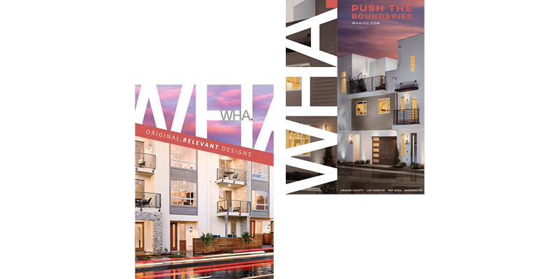
Overall, any type of Brutalist design is bold enough to catch peoples’ eye. Adopting its elements and principles help graphic designers achieve what most would call good graphic design. Popular Brutalist graphic design can be found everywhere! A few examples are the Adidas logo, the 1972 Olympic Games brand identity, the Beatles’ self-titled “white” album; it can also be found digitally in web design interfaces and internet search engines like some of the early versions of Google. For WHA, some of our current ad designs utilize Brutalist elements such as bold type that is large and getting cut off the artboard. I visualized white space as geometric shape opportunity for branding and brought that area to the foreground to be bolder and forward so that the logotype looks molded with the architecture. Surely, being surrounded by architecture influences graphic design.


Leave a Reply