
Architecture’s Relationship to Graphic Design: Design Principles + Elements
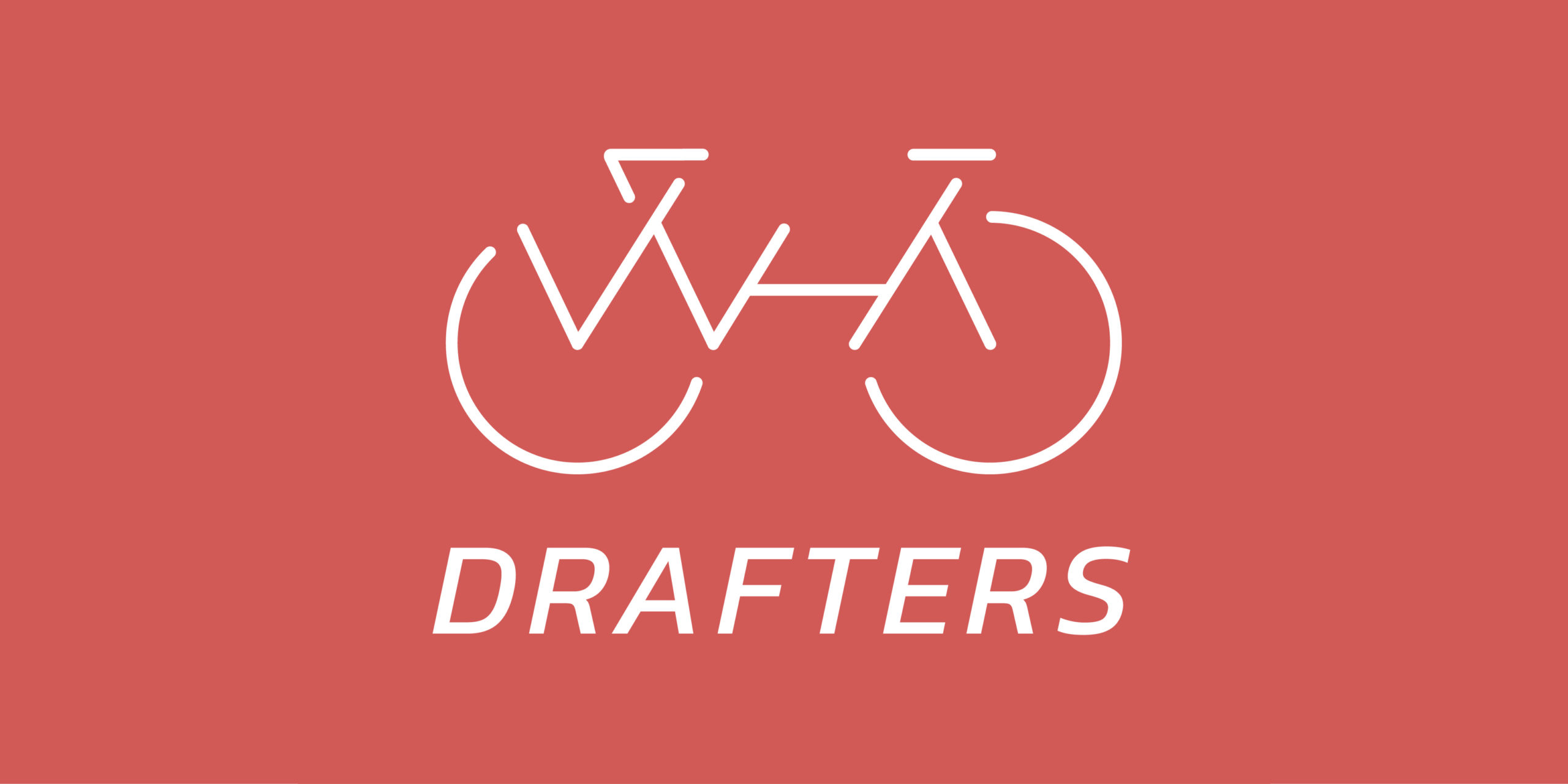
WHA Drafters Logo
National Bike to Work Day back in May was the kickoff for WHA’s summer bike club, Drafters. The bike club ran from May until September. Team riders enjoyed sunset bike rides along the Back Bay trail in Newport Beach every Thursday evening led by Abigail Margolle and Brandon Corbett.
While creating the WHA Drafters logo in collaboration with designers Marshall Johnson and Nick Manea, I was reminded that design principles are universal among all designers, especially between architects and graphic designers. The following principles and elements of design are what Johnson, Manea, and I focused on to execute an impactful logo for the WHA Drafters: balance, alignment, contrast, repetition, scale, movement, line, color, shape, space, unity, and hierarchy.
Johnson and Manea’s hand-drawn sketches needed to live as a logo, which is where I came into the picture — one graphic designer and two architectural designers. The three of us periodically met in collaborative spaces to run through countless rounds of design revisions. We discussed the translation of their drawings into logo design, which simplified the Drafters logo into what it is now after removing color choices, dynamic airflow lines, and a bicyclist. Between bringing out the rulers and tracing paper to measuring circumferences and line angles version after version, I realized that thinking like an architect makes me a better graphic designer.
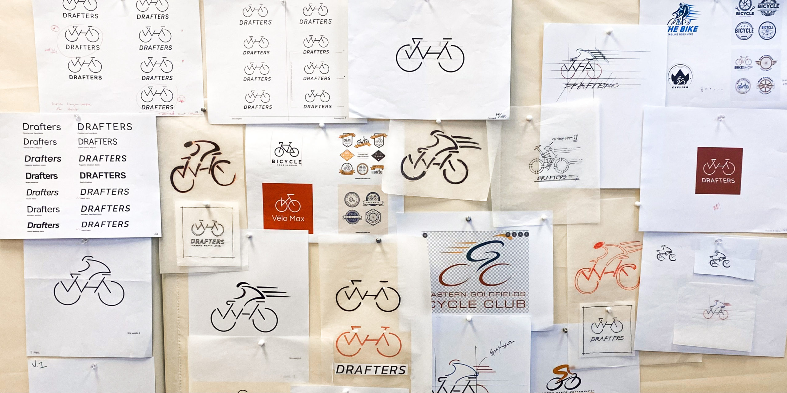
We analyzed the balance of the WHA letters that rest between the wheels. The alignment of x-heights matching horizontal and vertical axes was carefully considered. Contrast of movement was brought by creating a stationary icon with an italicized wordmark. Measuring tools defined repetitive circular shapes and lines. Choosing a thicker weight within the typeface brought visual hierarchy and scale among the emblem and wordmark. Tying in WHA’s red square and limiting color brought unity to this sub-brand.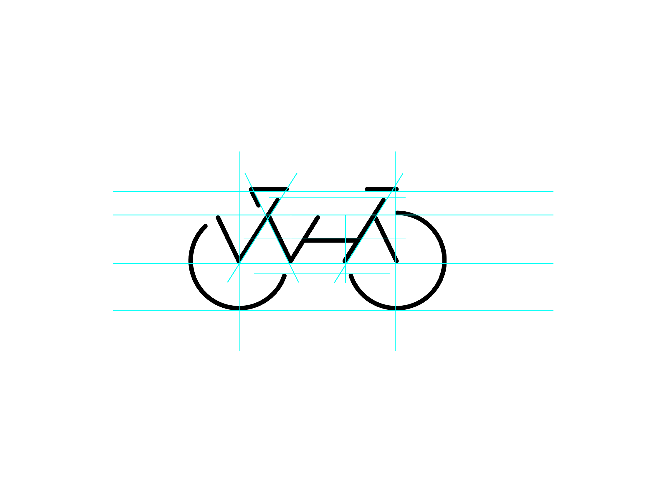 I found myself in the planning, design, and construction phases of the logo. Planning: Drafters had to function as a WHA bike first. Design: Drafters had to look bold, balanced, and on brand. Construction: the drawings had to come to life as a vectorized logo. With so much collaboration within the firm, I had to ask our talented designers Johnson, Manea, and Abigail Margolle, who gave Drafters its name, a couple reflective questions about the ideation process. Here is what they had to say:
How has your architectural background influenced your drawing of the Drafters logo?
When designing the logo, we took a similar approach like we would when designing a floor plan or an exterior elevation of a certain architectural style. We started with research, asked questions, and analyzed similar products already done by others. We sketched some initial ideas, stepped back, analyzed, looked at what could be done to improve. Made revisions and did it again and again. Once we felt good about it, we reviewed it with Jayme, asked for feedback, and revised accordingly. (Manea)
Geometry, symmetry, angles, circles, proportions (scale), lines, shape, dimension, alignment, positioning, and detail are what I focus on with drawing elevations. It’s the same with a logo. (Johnson)
How did you connect WHA to the Drafters logo?
We wanted the letters WHA to take part the logo design, so we studied multiple scenarios how that would work. Eventually we found a way to incorporate it into the bicycle design without distracting too much from the logo design. (Manea)
The Drafters logo design was inspired by the existing WHA logo. The WHA logo was perfect to incorporate as an interpretation of a bike frame and just had to add handlebars, a seat, and wheels. (Johnson)
How did you produce the name Drafters?
After a few rounds of brainstorming, it finally came to me on my drive to work…the WHA Drafters. It was a perfect parallel between architecture and cycling. Just as a team of draftsmen follow the lead of an architect to create a clean drawing set, a cyclist uses the technique of drafting to tuck into an area of low pressure behind the lead cyclist to preserve energy. (Margolle)
What is the process you used for your sketches?
Mostly sketches by hand until we had a good direction. Once we knew what we wanted it to look like, we partnered with our talented graphic designer and refined it on the computer. (Manea)
Define scope, create a theme, explore alternative concepts, and play with varying size, scale, colors, and line weights. (Johnson)
What is the future for Drafters?
We hope to continue to grow our group and provide opportunities to ride and socialize while creating relationships with anyone who shares our love of riding. (Manea)
T-shirts!? (Margolle)

Designing the WHA Drafters logo was such a special project for me, working alongside two architectural designers doing graphic design! I experienced a shared way of thinking that surpasses job title and industry. Architects and graphic designers think alike because the way we creatives think is rooted in the principles of design.
Much appreciation to all who drafted those warm Thursday evenings. These team riders brought fun, lived memories to a logo: Abigail Margolle, Brandon Corbett, Nick Manea, Marshall Johnson, May Liu, Olivia Nilges, Mike Cantrell, Dan Dugan, Lindsay Hezmalhalch, Eric Hezmalhalch, Wallace Fang, and Jeff Johnson. Until next summer, WHA Drafters!

Leave a Reply