
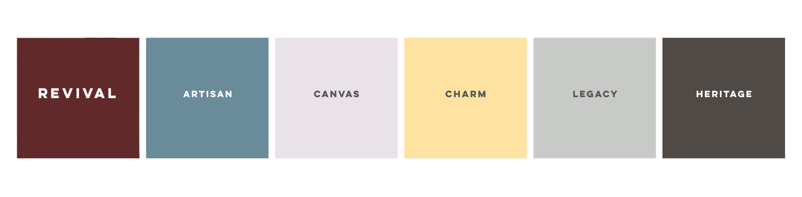
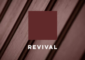
The Revival Era – WHA’s 2026 Coty Palette Brought To Life
As we move into 2026, design is shifting toward solutions that feel intentional, grounded, and emotionally resonant. After years of cool minimalism and ultra neutral palettes, homeowners and communities are gravitating toward environments that feel warmer, more tactile, and rooted in a sense of history. WHA’s Color of the Year, Revival, captures this shift with a richness that is both familiar and forward looking – a tone with depth, and character.
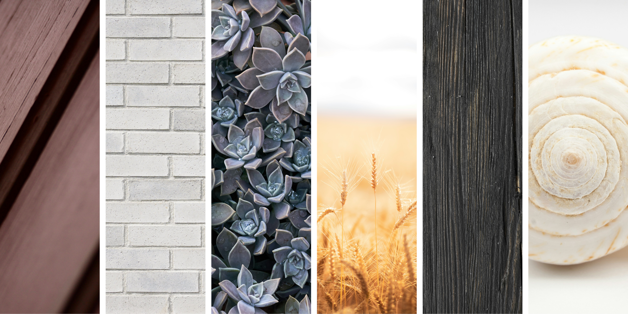
A defining force this year is rising AI fatigue. In our new world of hyper-curated, synthetic visuals, people are moving back to what feels human: color that reads lived in, and materials that demonstrate their hand. Our 2026 palette meets this moment to warm elevations, soften massing, and reveal the beauty of texture – supporting architecture that is grounded and timeless.
What’s most exciting in 2026 is how color and materiality are working together. We’re seeing finishes that lean tactile and imperfect – textures that invite touch and reveal natural variation. Regenerative, naturally uneven, and radically restructured surfaces – from hemp and wool‑like bouclés to crumpled linens and bio‑based blends – signal a broader appetite for depth and authenticity in the built environment. That sentiment translates directly to building exteriors through hand‑troweled sand‑finish stucco, honed stone, textured wood, and matte metal – surfaces that are honest, expressive, and enduring.
Our 2026 palette was developed with this material story in mind. Earthy, grounded neutrals and soft, warm undertones create a quiet foundation; rich yet controlled contrasts introduce individuality without visual noise. These hues build layered streetscapes that feel cohesive rather than flat. The palette supports craftsmanship over convenience – a return to finishes that age well with traceable character.
This approach reflects the broader cultural mood of 2026: color as identity and storytelling; authenticity over perfection; and a refined, quiet luxury that favors softly layered palettes over louder effects. We see 2026 as a year of redirection. Revival with its supporting palette helps reconnect color to identity – bridging nostalgic familiarity with contemporary design to create exteriors that are expressive, rooted, and deeply human.
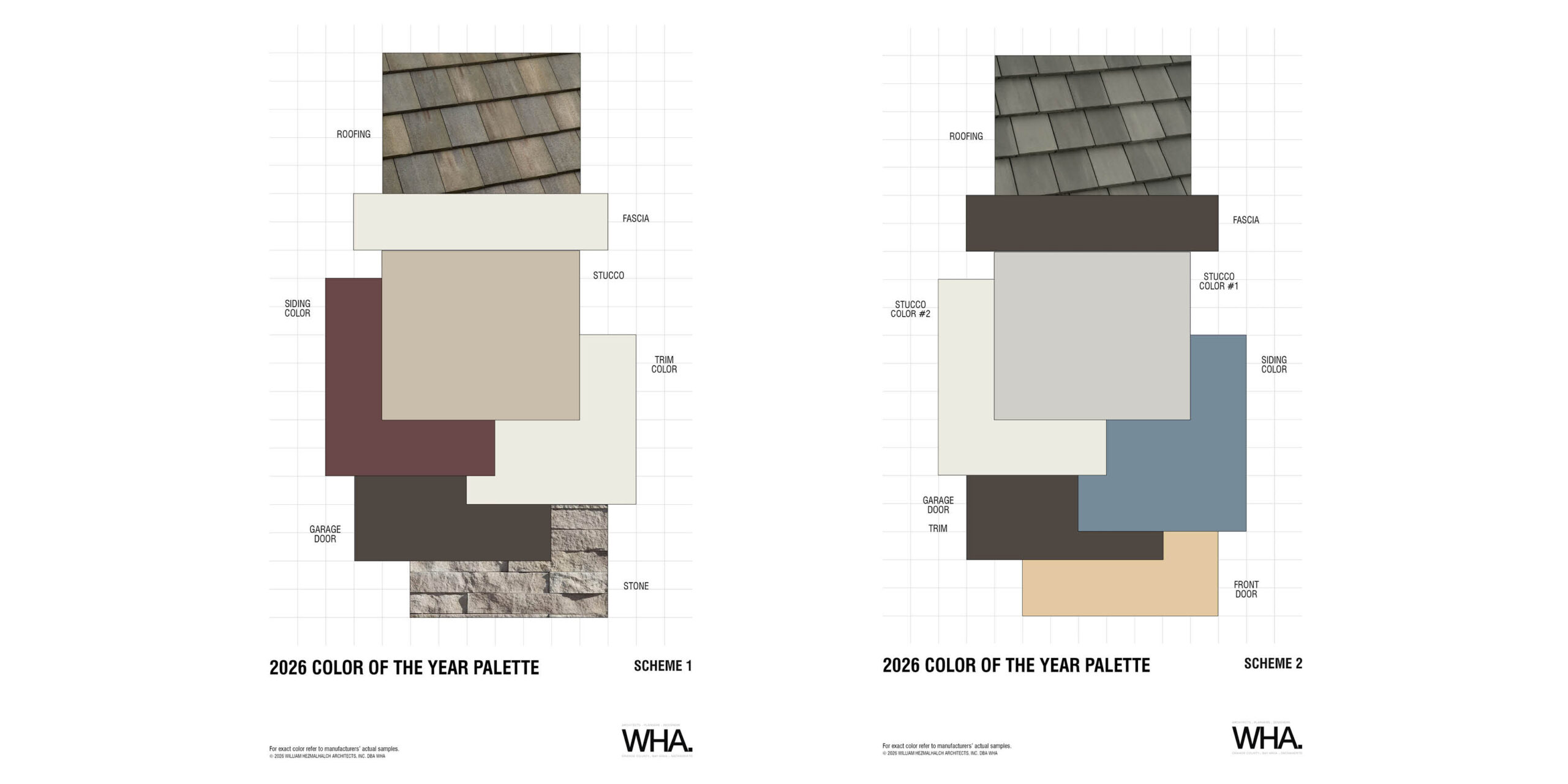
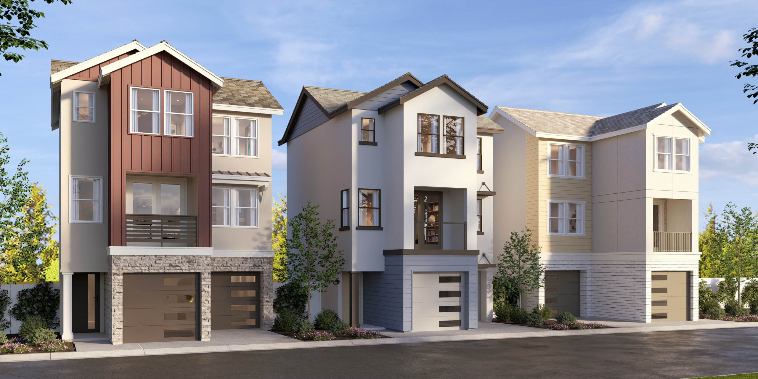
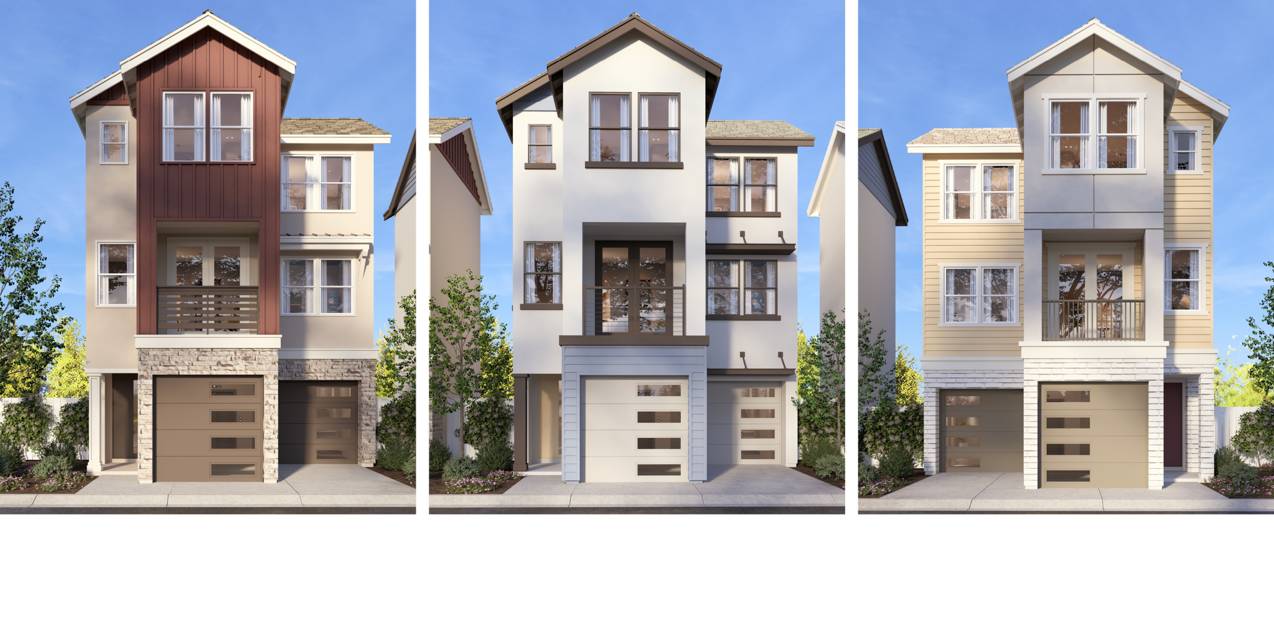
Our 2026 architecture prototype brings our palette to life. Revival leads the story with red siding, and the supporting hues provide balance – softening transitions, highlighting massing, and enriching each material. Together, the colors show how a well‑crafted palette can strengthen identity and bring warmth and cohesion to a diverse set of elevations.

Leave a Reply