
WHA Gets a Brand Refresh!

WHA is excited to announce that our company name has officially changed from William Hezmalhalch Architects to WHA. Our award-winning Branding Studio, Placewright Design, created a logo that is simple and timeless. This brand mark not only speaks to the quality and level of design, it also conveys the fact the WHA is a one-stop-shop where multiple integrated Studios work together to create cohesive solutions for our clients.
WHA strives for strength through its relationships. The letters “WHA” are connected to signify our enduring passion for building and maintaining strong relationships with our clients and each other. No person stands apart, we all work together to help realize our clients’ dreams.
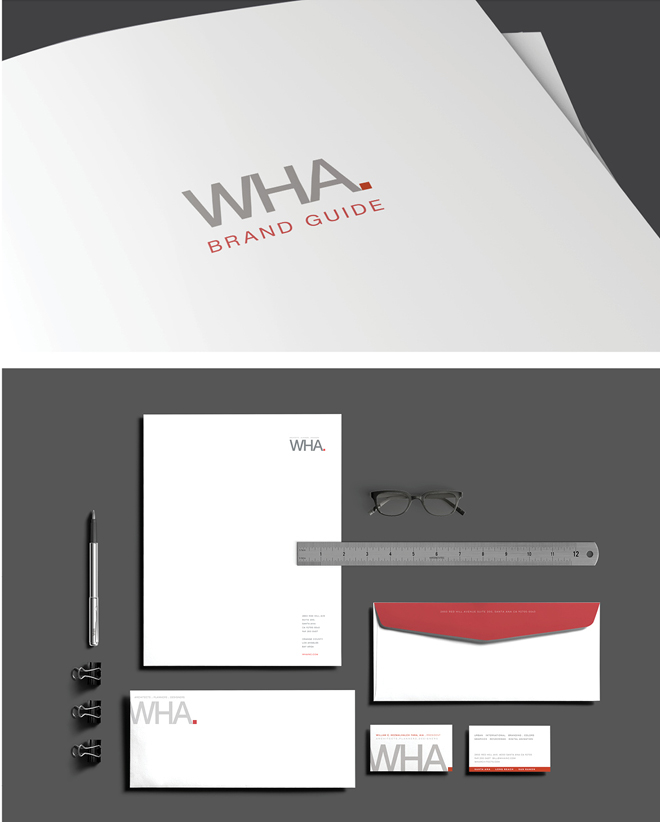
The box after our name exemplifies that we are pushing the envelope to develop out-of-the-box ideas where creativity and innovation shine through.
The new logo’s color choice is deliberate. Gray is reliable and balanced, a distinguished shade. The red represents WHA’s strength and assertiveness; it’s strong, bold and full of life.

The rebranding of WHA has been an exciting transition. Join us on our journey as we transform lives and design a better world.


Leave a Reply